
CLEARLY!
Speech Therapy Game for the Parkinson’s Community
Awards and Media Features
I’m honored to share that CLEARLY! was recognized with an award at the 2024 Serious Play Conference. Thank you for acknowledging our mission and providing a platform that allows us to inspire others with the work we do.
Read about the game in Kevin Lavery's article, the "Say It Loud and Clear: Persisting Through Parkinson's With Play" where he delves into how CLEARLY! is making a difference in speech therapy for people with Parkinson's.
Empowering Progress for People with Parkinson’s
At its core, our game is designed to offer people with Parkinson's a fresh and engaging way to practice speech therapy every day. We wanted to break the monotony of traditional exercises and create a tool that not only encourages consistency but also sparks real progress.
Too often, individuals with Parkinson's find themselves stuck at a certain level of speech proficiency. Our goal was to change that by providing a platform where they can grow, improve, and move beyond maintaining the status quo. We believe that everyone deserves the chance to reach their full potential, and speech therapy should be a journey of progress, not stagnation. But we didn’t stop there. We wanted to make this practice interactive—something that could foster deeper connections between users and their loved ones or caregivers. By empowering those around them with the tools to communicate more effectively, we aim to create a supportive environment where therapy is a shared experience, not a solitary challenge.
Our vision is to ignite a sense of community, motivation, and hope. We want to inspire people with Parkinson's to keep moving forward, not just in their speech therapy, but in their daily lives. By making therapy engaging, empowering, and deeply connected to the people around them, we hope to bring about meaningful change and progress—because no one should face this journey alone.
Designed for Speech Improvement: The Power of Clarity and Loudness
At the heart of CLEARLY! is a deep understanding of the core principles of speech therapy—clarity and loudness. These two elements are essential for improving speech outcomes in individuals with Parkinson’s, and they form the foundation of our game’s design.
To encourage real progress, we’ve embedded these principles into the gameplay itself. In order to play, users must actively engage in speaking clearly and loudly—making them the entry ticket to success. This dynamic approach ensures that speech clarity is directly tied to how well the user’s communication partners can understand them, while loudness is measured by the device’s microphone, motivating users to reach and sustain appropriate volume levels.
Unlike traditional solo therapy exercises, our game incorporates a unique, interactive element: the ability to switch roles with gameplay partners. This not only allows the user to learn by example, but also encourages mimicking successful speech patterns in real-time. By practicing in this collaborative way, users gain a deeper understanding of how to maintain and improve both clarity and loudness, making it easier to transfer these skills into their daily lives.
How our research resulted as a digital game-solution: Achieving goals with minimal friction
During early playtesting, we discovered that users overwhelmingly preferred a digital format over an analog one. A digital game allows for a more seamless interaction, minimizing the potential for frustration. Analog tools, like physical cards, presented challenges—particularly when users needed to stay on track with game progress or manage multiple components at once. With the digital version, the game can automatically adjust and manage elements such as card additions, removals, timers, and microphone settings, which keeps the focus where it should be: on the user’s performance and progress.
Moreover, centralizing all the game’s interactive elements—rather than having them spread across a physical table—makes the experience less overwhelming, especially for patients who may experience symptoms like shaky hands. In this digital format, assistive tools are easily accessible, and the gameplay flow is consistent and intuitive, allowing users to focus entirely on improving their speech without being distracted by the logistics of interacting with the game itself.
My approach was grounded in understanding how our audience would interpret the game’s objectives and navigate the gameplay.
Ultimately, we needed a design that would support our users, not overwhelm them.
Design Decisions for Supporting Users
-

Prioritizing Accessibility for Sight-Related Challenges in Parkinson’s
Research revealed several sight-related challenges associated with Parkinson’s, which led me to prioritize accessibility in every aspect of the UI. I chose OpenDyslexic as the typeface to ensure optimal readability (Franzen et al., 2019), and the magenta-green color scheme was selected specifically for its effectiveness in supporting individuals with the two most common types of color blindness (Birch et al., 1998; National Eye Institute).
-
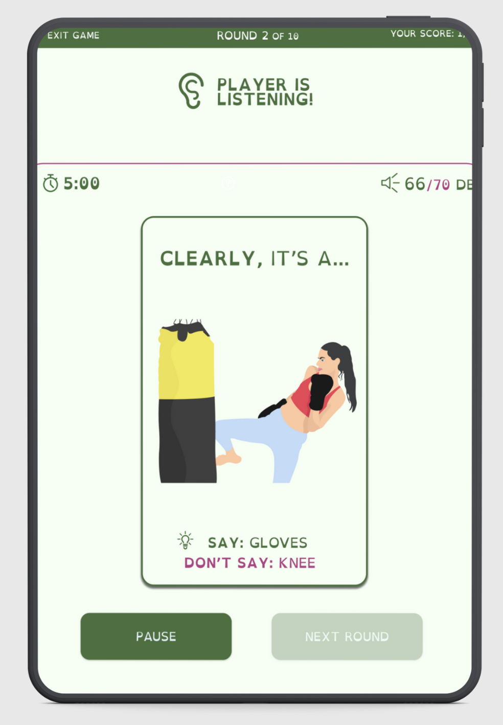
Ensuring Uninterrupted Gameplay for an Immersive Experience
I wanted the focus to be entirely on gameplay—making sure that users could easily perform the necessary tasks without distraction. The majority of the screen mimics the feeling of holding a hand of cards, just like in a real-life two-person card game. I wanted users to feel like they were sitting at a table with a partner, where the focus is on the cards in your hand, with only slight peripheral awareness of the opponent.
-
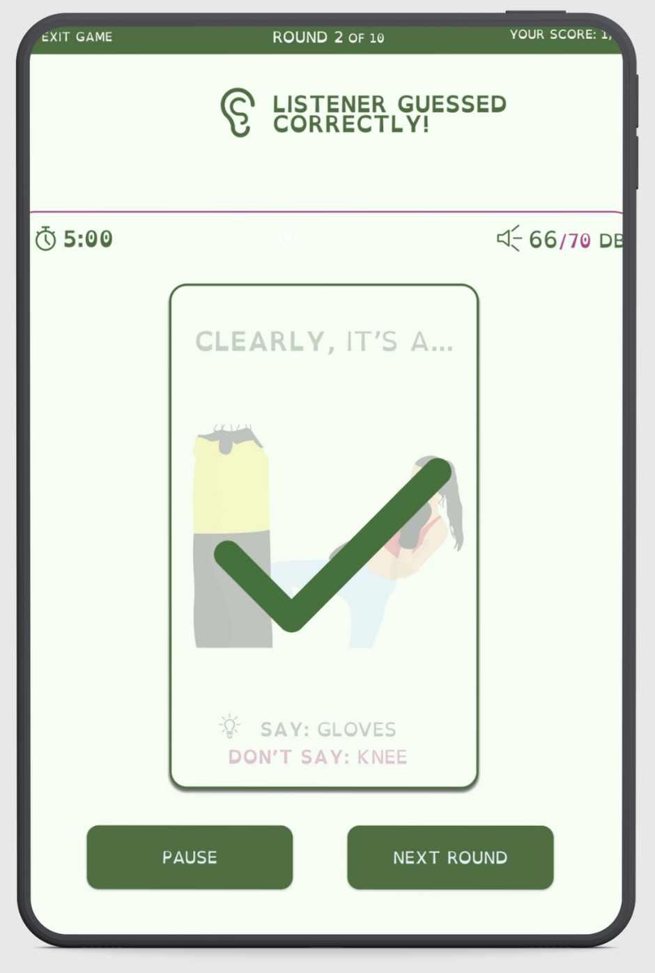
Key Assistive Tools Positioned for Easy Access
Key assistive tools are placed above the "hand" for easy access, and status updates (like turn indicators, actions, or win notifications) are displayed where the opponent would be in a physical setup. This layout was intentionally designed to minimize clutter and maximize clarity.
-
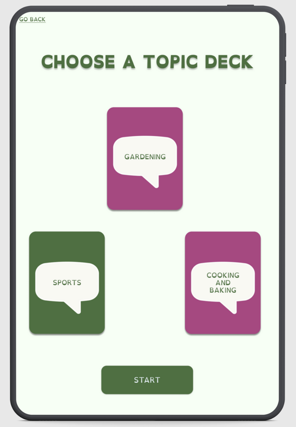
Use of Simple Symbols Over Text for Streamlined Communication
In terms of graphics, we opted for common symbols instead of long text, eliminating the need for users to process complex language while they played. This helped simplify the game’s interface and ensured that users could stay focused on the task at hand. Our graphic designer and I agreed on using soft, simple illustrations for the cards—nothing too complex or overwhelming. Think less “Renaissance painting” and more visual cues that are easy to interpret without overstimulating the user.
-
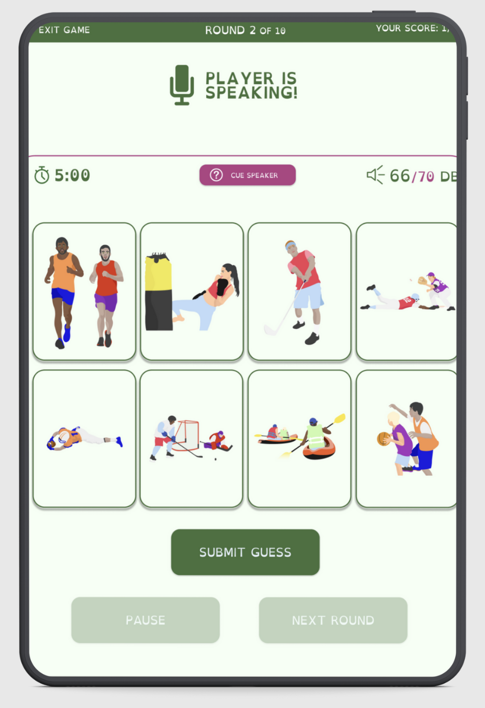
Minimizing the Impact of Fine Motor Control Challenges
I wanted to address another key consideration—the issue of fine motor control and hand tremors. To address this, we carefully designed the buttons, padding, and spacing to make them more forgiving for users who may have shaky hands. We increased the size of clickable areas, ensuring that the buttons had ample padding around them to reduce the chances of accidental clicks or difficulty selecting smaller components. This was particularly important for actions like selecting cards or confirming moves. By spacing out the buttons and making them larger, we created an interface that was easier to navigate for users with motor difficulties.
-
Providing Clear, Immediate Guidance Throughout the Game
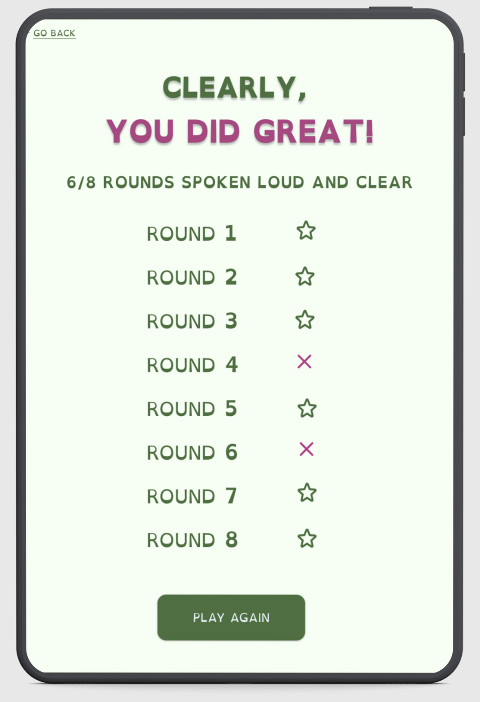
One of the most important design principles I focused on was minimizing the need for users to search for direction or guidance during the game. I wanted the layout, prompts, and overall flow to make users feel as though they were being guided step-by-step through the experience, much like a click-through tutorial on a website or app. I didn’t want players to have to stop and think, “What do I do next?” Every button and interaction was intentionally placed in a linear order, so users could follow a clear, smooth progression from one step to the next. The layout and design were made to ensure that the user always knew where to click and what to do next, without feeling lost or confused. Additionally, we used clear visual feedback (like color changes and animations) to help users confirm their actions and reduce confusion, especially when navigating menus or making selections. The system also provided a slight delay before a selection was registered, giving users a chance to make adjustments if needed.
The game’s flow was designed to be intuitive. If a player completed an action, the next step would immediately become clear—whether that was a visual cue, a new prompt, or a simple animation guiding them forward. This was especially important for users who may struggle with memory or cognitive challenges. By creating a design that feels like a “hand held” through the entire game, players could focus entirely on the experience itself—improving their speech and enjoying the gameplay—without being bogged down by the interface.
CLEARLY!
CLEARLY!
CLEARLY! is available on both Mac and Windows. Try playing now and start improving your speech!
Curious about how it all works? Check out our gameplay demo to see the design in action and get a better sense of the experience.
Credits
Madeline Allen, Information Architect, UI Designer, UI Developer
Maura Phillippone, Game Researcher, Narrative Designer, Instructional Designer
Adam Elfawal, Developer
Jesse Sanderson, Graphic Designer, UI Developer, Secondary Game Researcher


