Redesigning a Design/Build Buisness's Website: Expanding the Brand Beyond Kitchens
A Fresh Digital Presence to Showcase CKD’s Full Range
I was brought onto the CKD (Complete Kitchen Design) team to lead a full redesign of their mobile and desktop website. CKD wanted a fresh, dynamic site that reflected their expertise not just in kitchen design and installation, but also in a broader range of home projects. They aimed to show potential customers that they could handle everything from design and material supply to full installation for any space in the home or commercial setting.
The goal was to create a site that breathed new life into the business and worked as a key tool to drive visitors into their showroom. The new website needed to act as a snapshot of CKD’s services, guiding users through their offerings in a clear, concise, and engaging way.
Bridging Design Expertise to Uncover CKD’s Unique Vision
To kick things off, I led a collaborative discovery phase to understand the client’s vision. As part of this, I presented a selection of competitor and supplier websites for cabinetry to help CKD visualize industry standards and gain a better understanding of their preferences. While CKD’s team is made up of skilled designers, they were not entirely sure how to articulate their needs in terms of UX and web design language. Through this exercise, we pinpointed key elements they liked and didn’t like in other sites, setting a solid foundation for the redesign.
Streamlining a Cluttered Site for Comprehensive Navigation
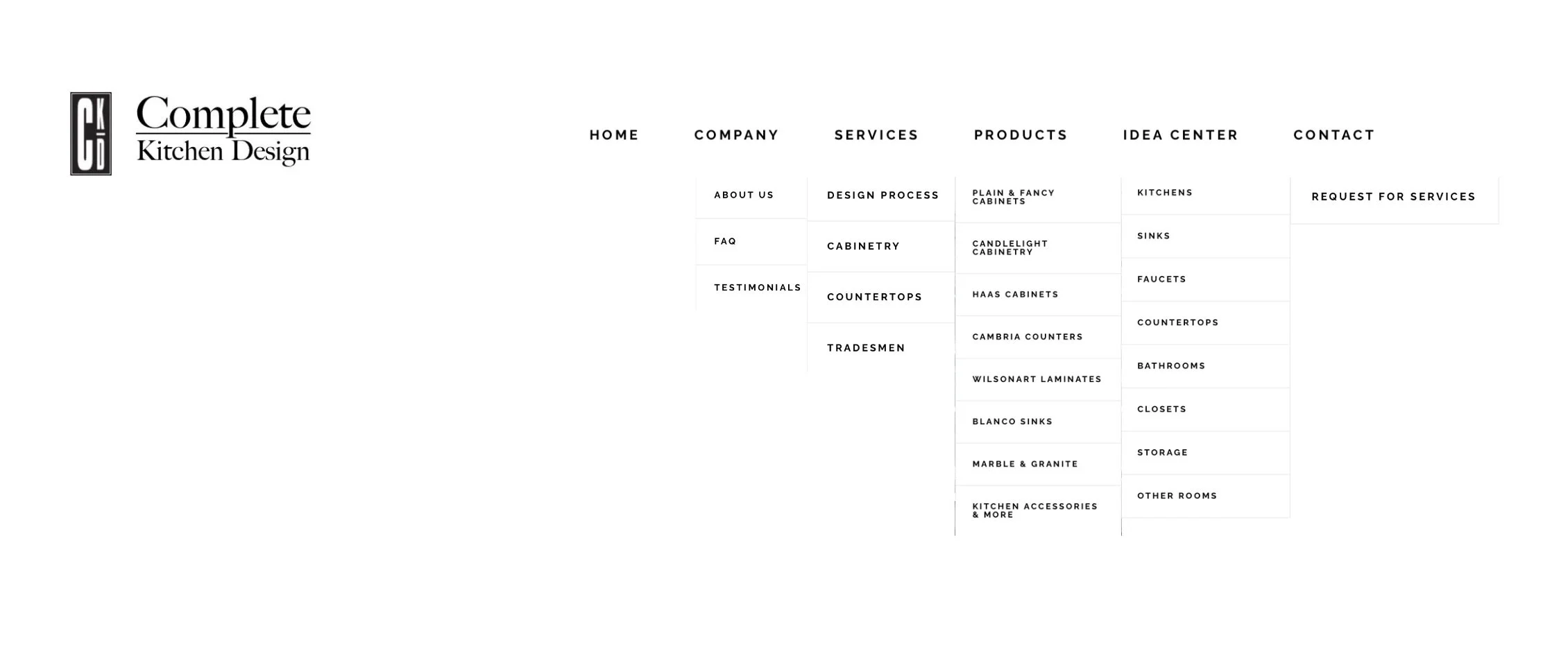
The next step was conducting a site flow analysis to evaluate how the existing website functioned from a user’s perspective. I navigated through the current site to understand how long it took to find the business's services and what obstacles users would face. What I discovered was a website with a convoluted structure: numerous dropdowns, excessive information, and repetitive content made it difficult for users to quickly grasp CKD’s full range of services. The navigation was long and cluttered, leading to frustration and confusion.
Former Menu
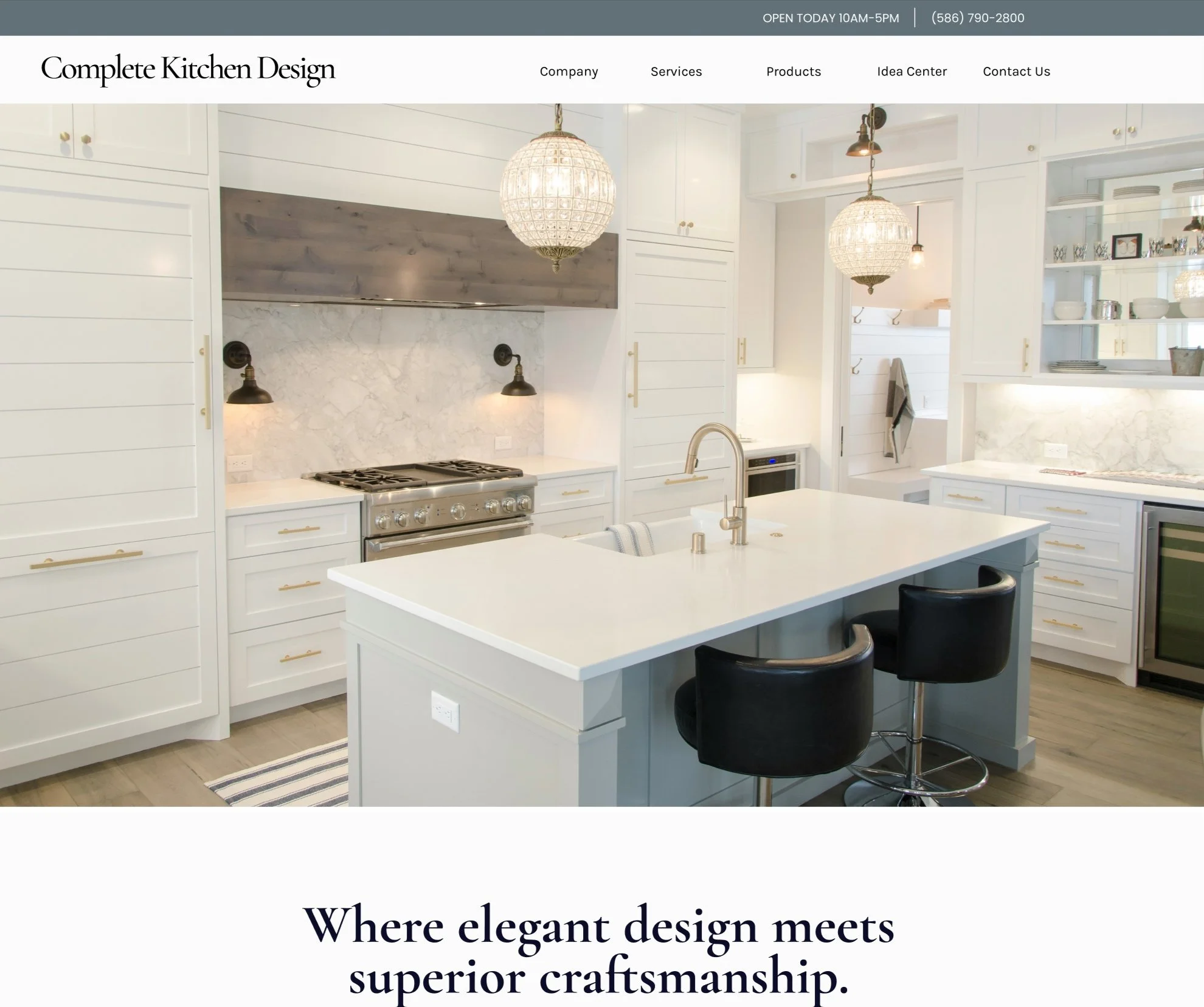
New Menu
Redesign Strategy
With a clear sense of the issues, I set out to simplify the user experience. The redesigned site focused on a streamlined structure, reducing the number of clicks needed to access essential information. I prioritized clean, minimal navigation, showcasing CKD’s offerings—from design to installation—so users could easily identify the full scope of services available to them. I condensed redundant pages and removed unnecessary clutter to ensure the user journey felt smooth and intuitive.
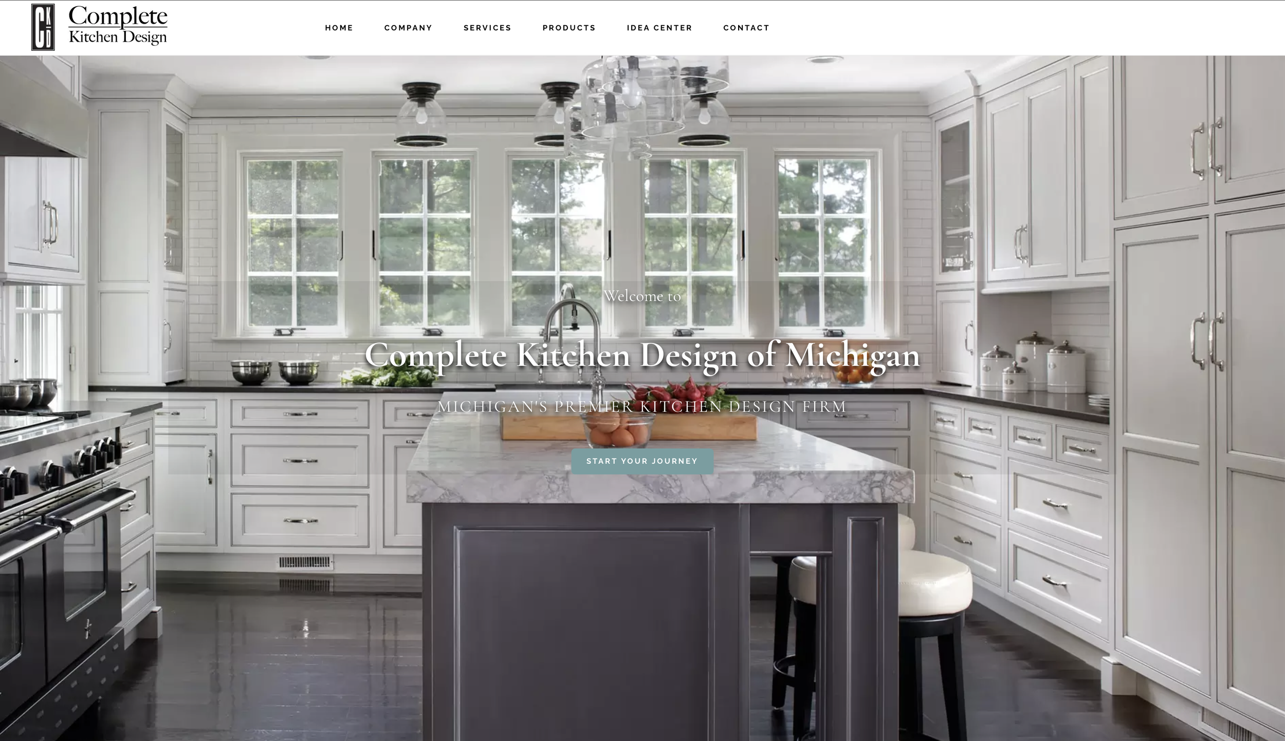
A key part of the redesign was translating CKD’s showroom aesthetic into the website. I adopted the same warm, earthy tones of sandy beige and washed denim to create a sense of familiarity and comfort, making the digital experience reflect the welcoming atmosphere of the physical showroom. To ensure consistency, I used the same font as CKD's logo across the site, reinforcing their brand identity.
Tailoring Accessibility for CKD’s Demographic
Given CKD’s clientele, which largely consists of individuals over the age of 40, I placed a strong emphasis on accessibility and mobile optimization. The original site had many accessibility issues, including hover dropdowns with poor contrast and small buttons, particularly on mobile devices. I eliminated hover interactions and ensured that buttons were large enough for easy tapping, improving the site’s usability for those with limited motor abilities or lower technology literacy.
Additionally, I made sure the site adhered to accessibility standards, ensuring high contrast and easy-to-read text for users with visual impairments. By simplifying the design and optimizing for mobile, I made sure CKD’s website was accessible to a broader audience and improved the overall user experience.
Turning Online Interest into Showroom Visits
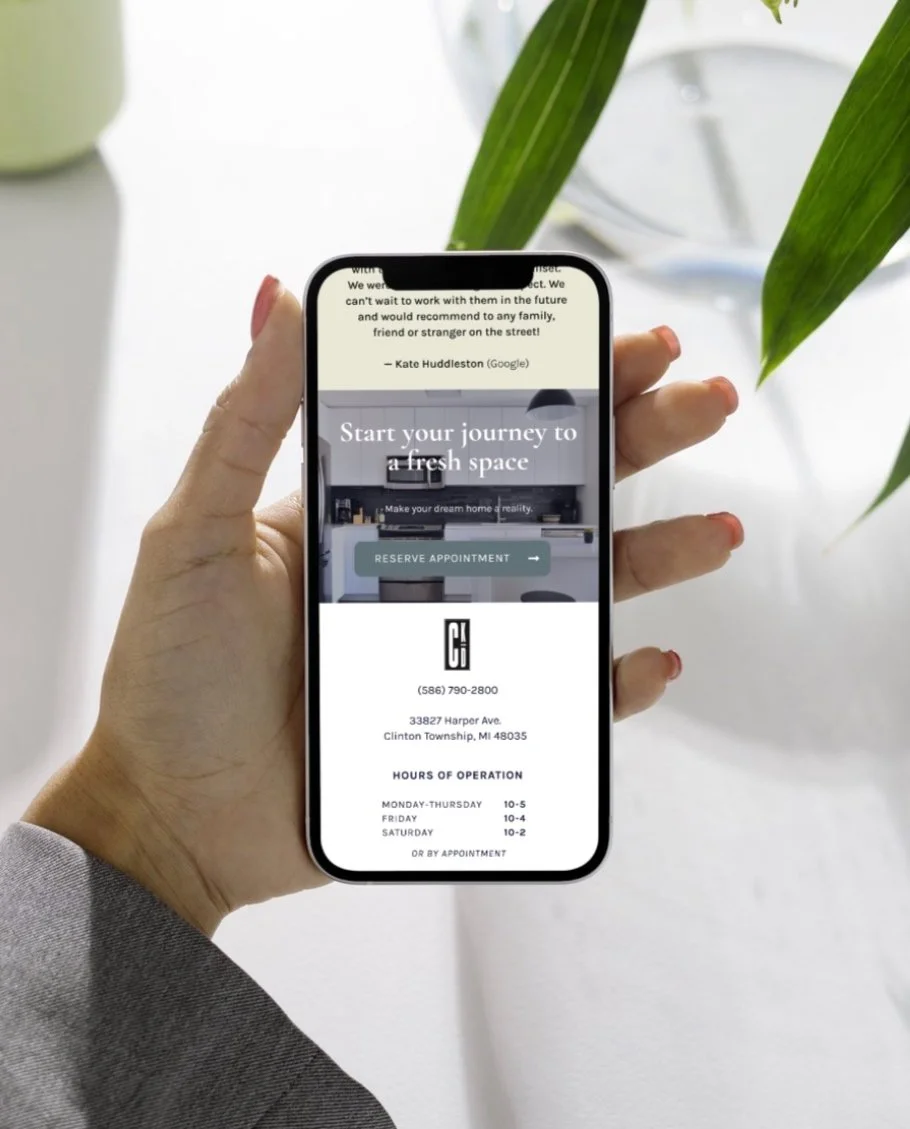
To drive conversions and encourage site visitors to transition to actual showroom visits, I made sure to prominently feature the business's phone number at the top of each page, as well as in the footer. Each page was designed to close with a clear call to action, inviting users to get in touch with CKD. This strategic placement made it easy for users to connect with the business and encouraged them to take the next step towards visiting the showroom. The goal was to transform digital engagement into real-world connections, ensuring that CKD’s online presence worked as a bridge to bring potential clients into their physical space.
