East Lansing Film Festival
During my undergraduate studies at Michigan State University, I had the opportunity to work on a project that merged two of my passions: design and storytelling. I was part of a team of ten students tasked with revamping the Instagram presence for a long-running and beloved local film festival. This project allowed me to apply my UX and brand design skills to a real-world scenario, helping elevate the festival’s digital identity while ensuring a cohesive and engaging user experience.
Revamping the Social Media Presence for a Local Film Festival
The Challenge: Organizing a Large Creative Team
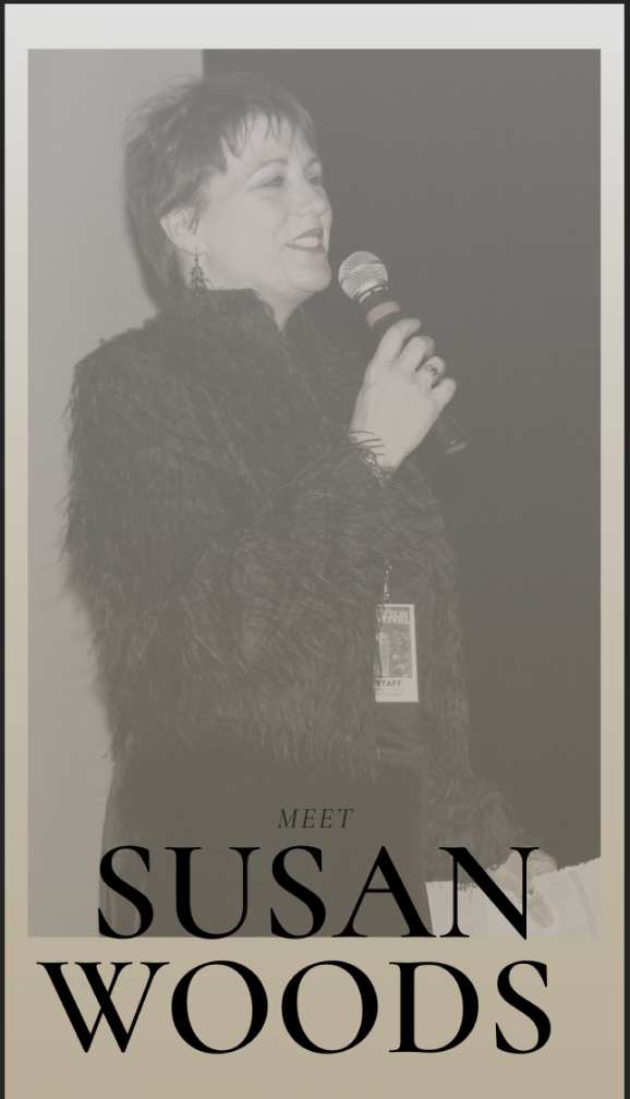
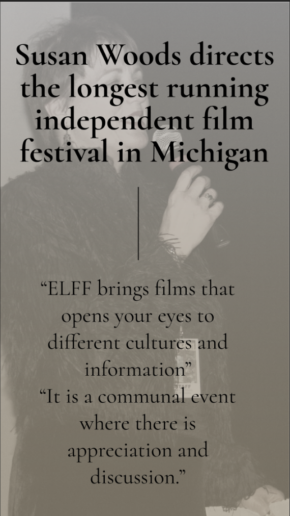
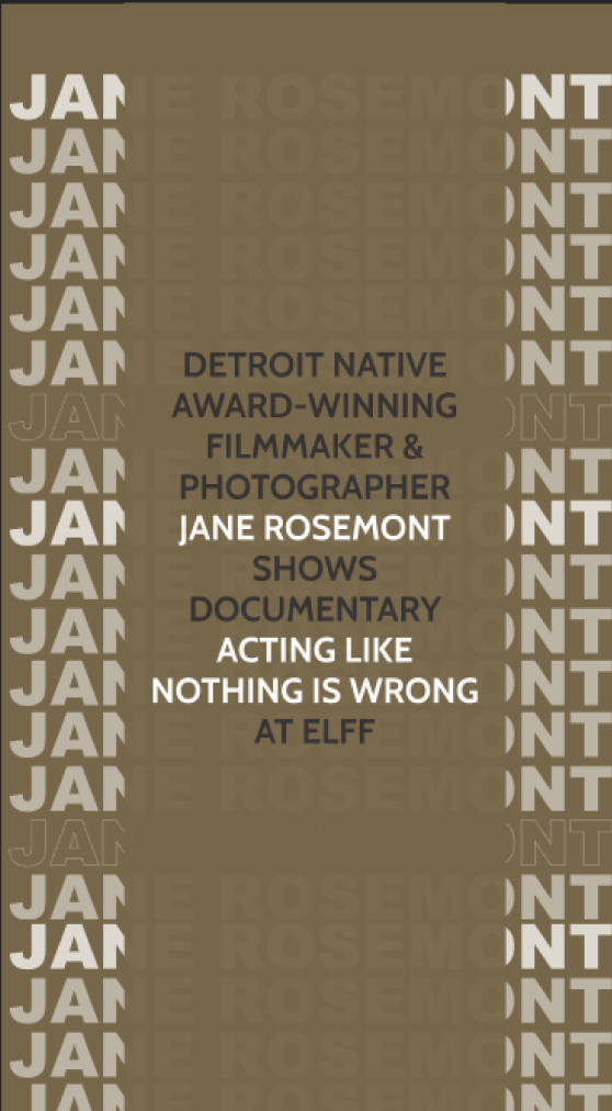
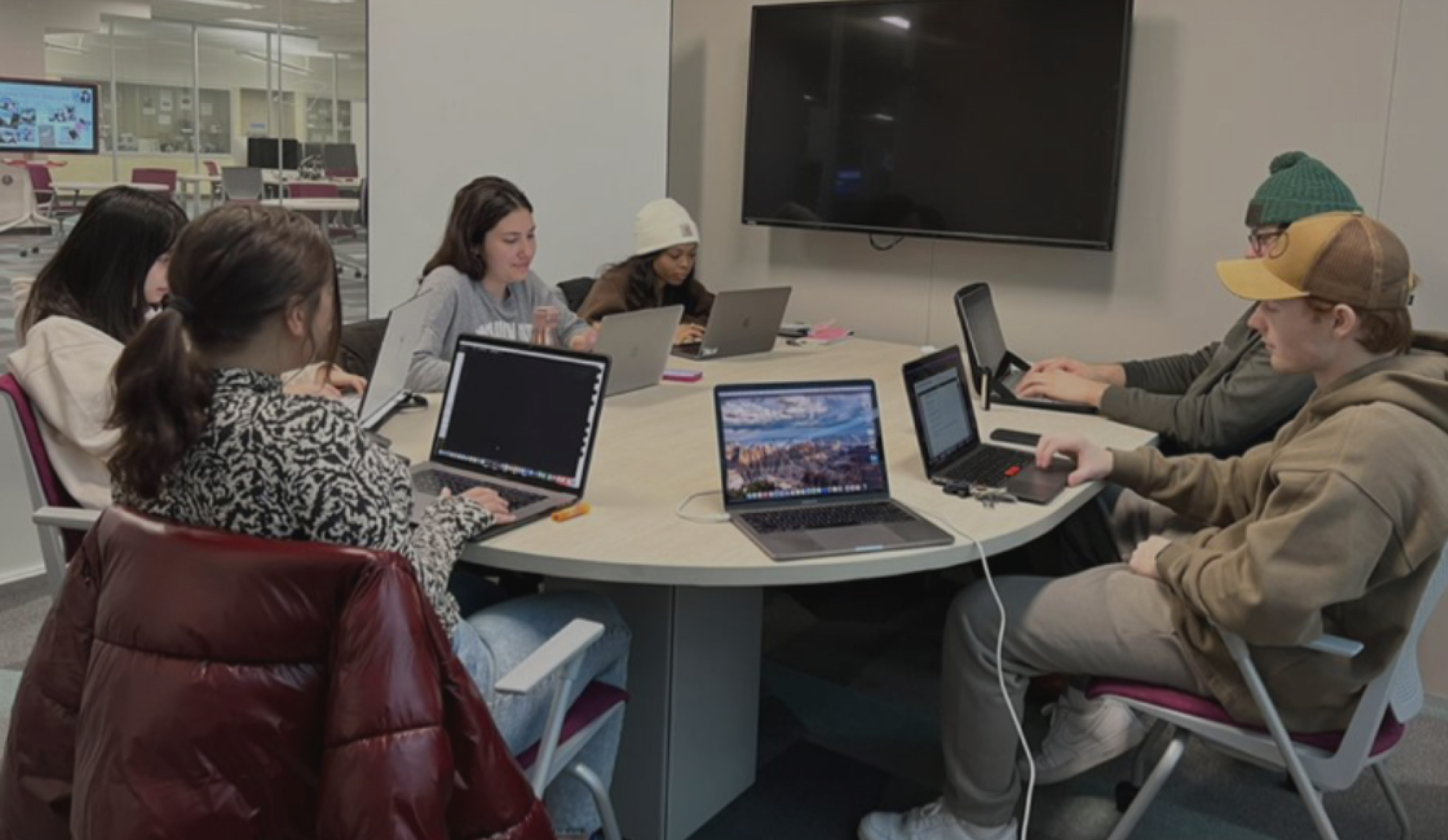
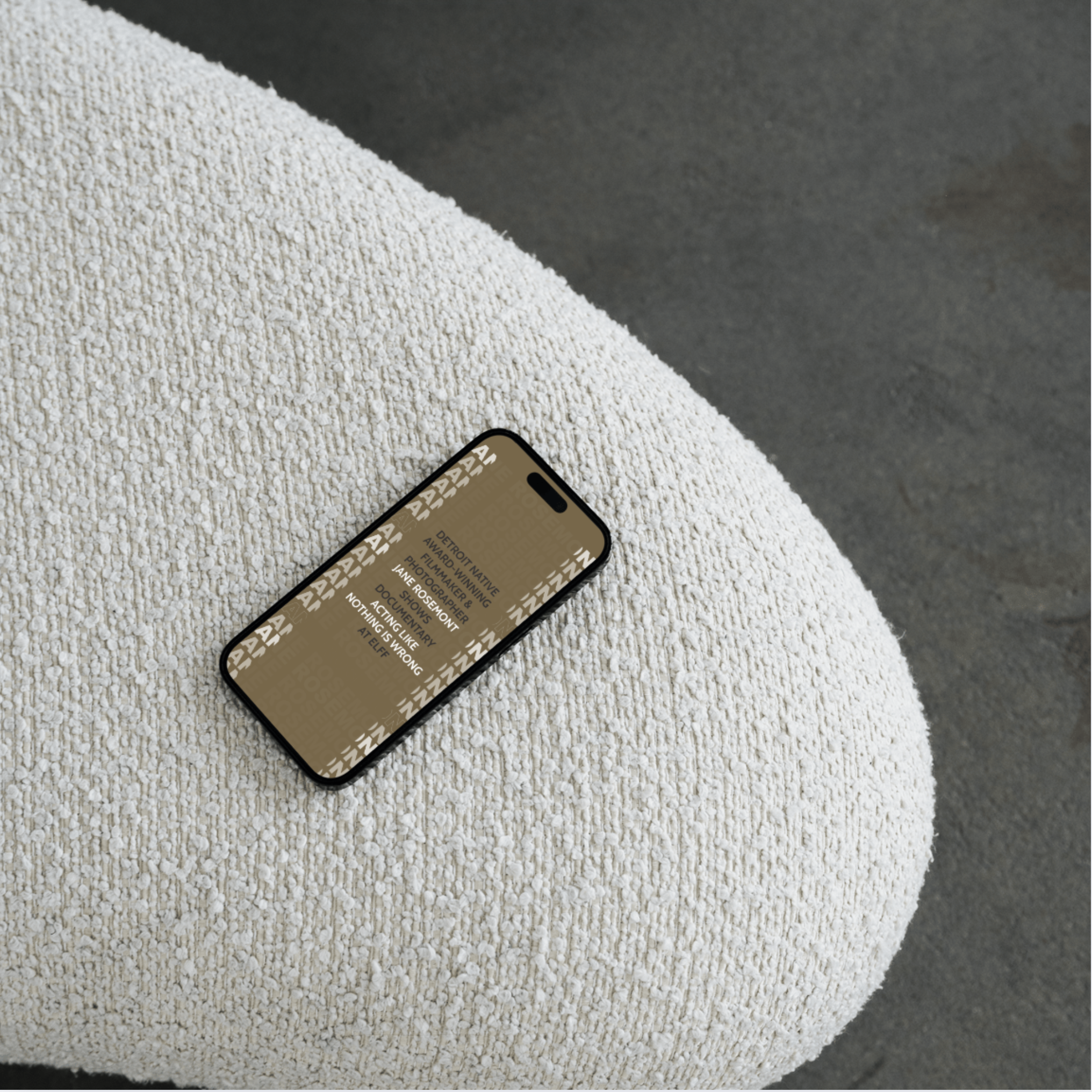
Managing creative direction in a group of ten can be a challenge, especially when dealing with subjective elements like social media graphic design. To maintain efficiency, we split into two sub-teams: one focused on Instagram posts and the other on Instagram Stories. I was nominated to lead the Instagram Stories team, where I took the initiative to establish a unified design style guide for both teams. This ensured that despite different people handling different elements, the festival’s brand identity remained cohesive and recognizable across all touchpoints.
Establishing a Cohesive Visual Identity
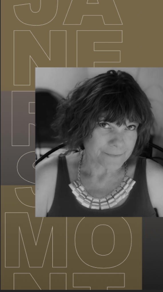
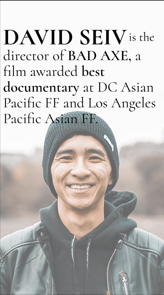
Since this was a significant anniversary year for the festival, our client wanted silver to be a dominant color in the branding. I wanted to amplify the festival’s sense of elegance—something previous years had not focused on. I curated a color palette incorporating metallic tones like silver, bronze, and gold, reminiscent of prestigious film awards. To match this elevated theme, I selected a sophisticated typeface that reflected the grandeur of cinema and aligned with the festival’s prestige.
Palette 1: Solid Colors
Structuring Content for Maximum Engagement
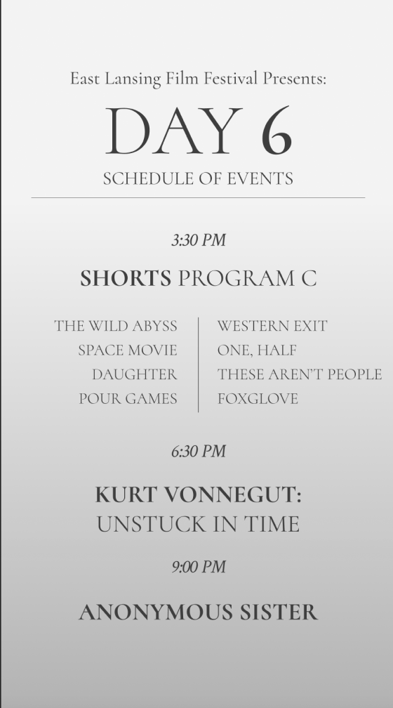
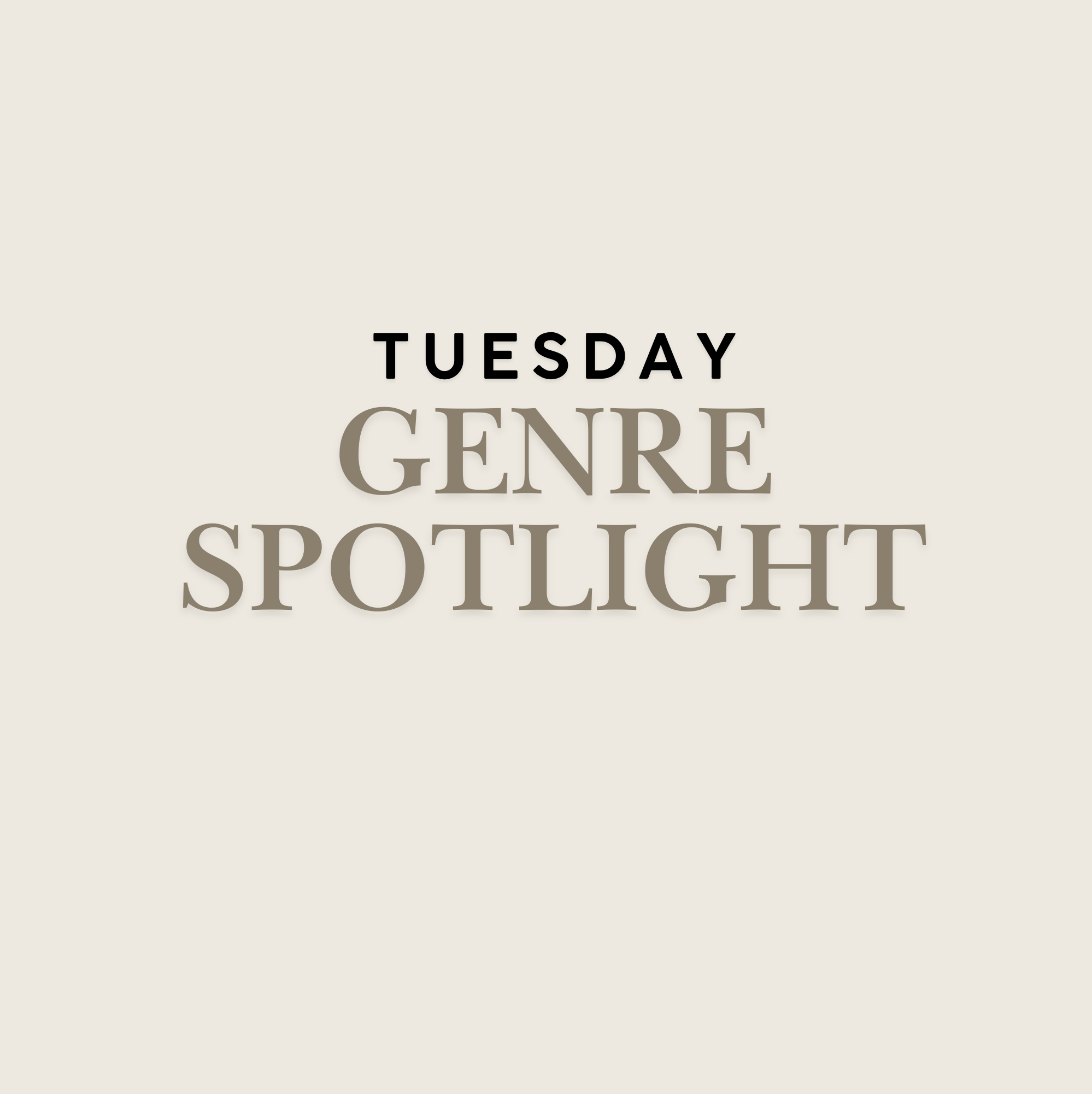
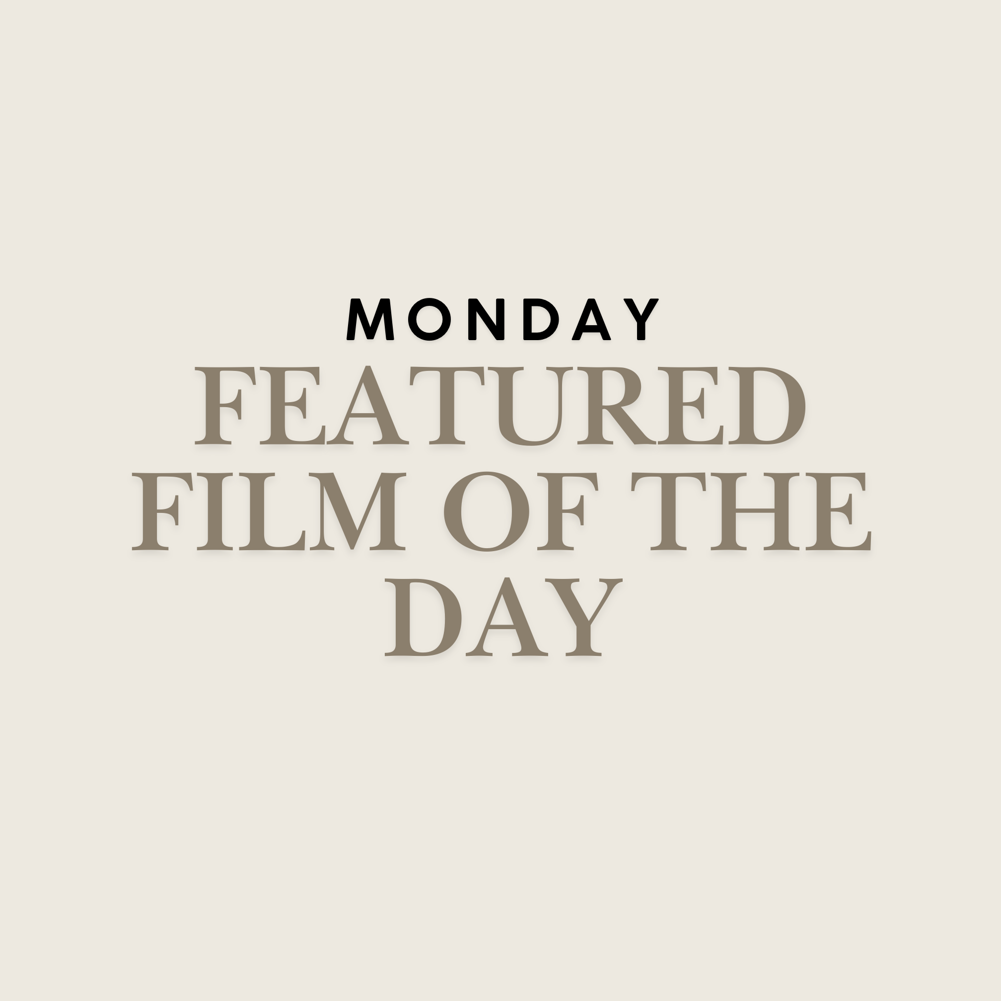
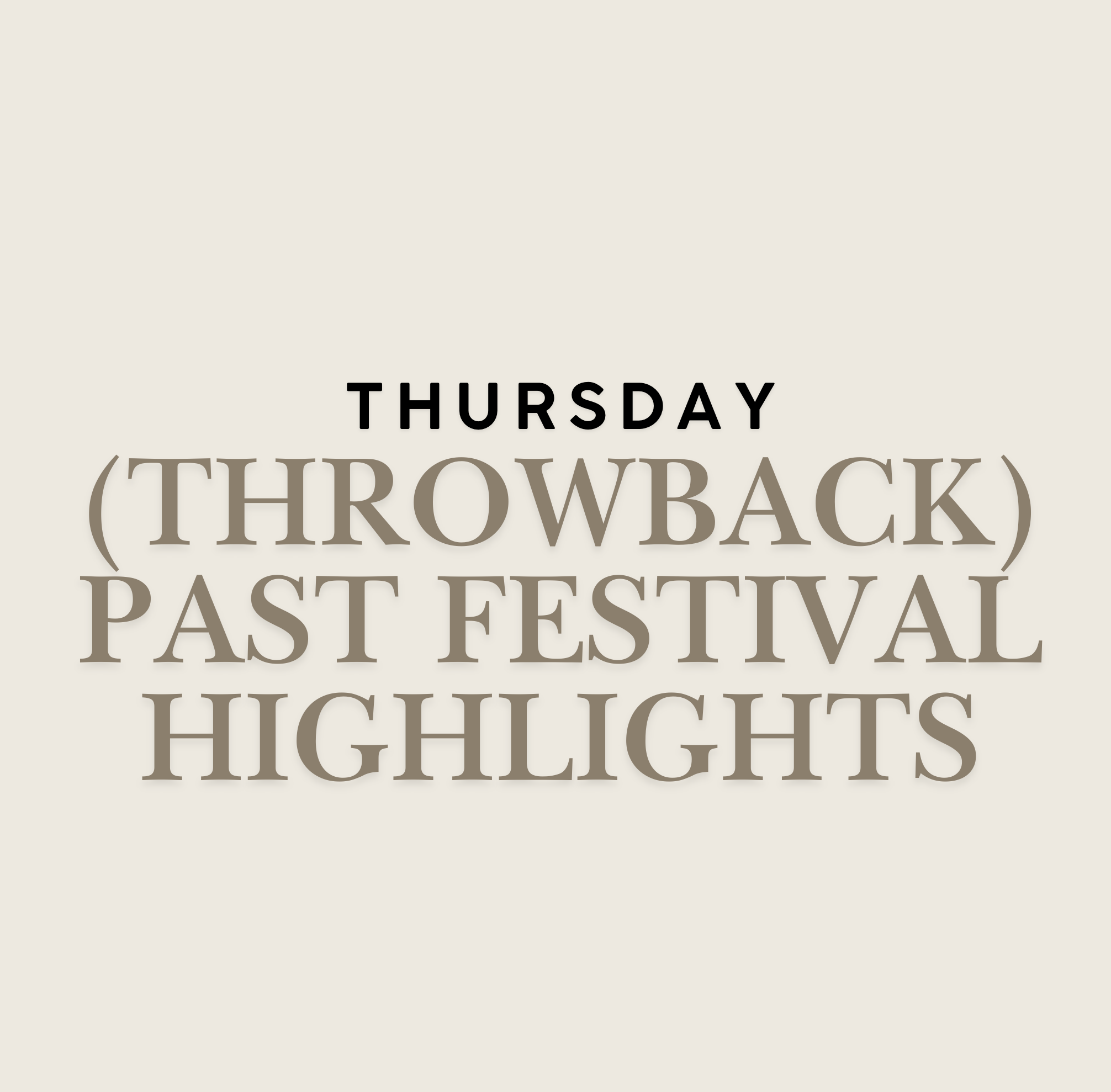
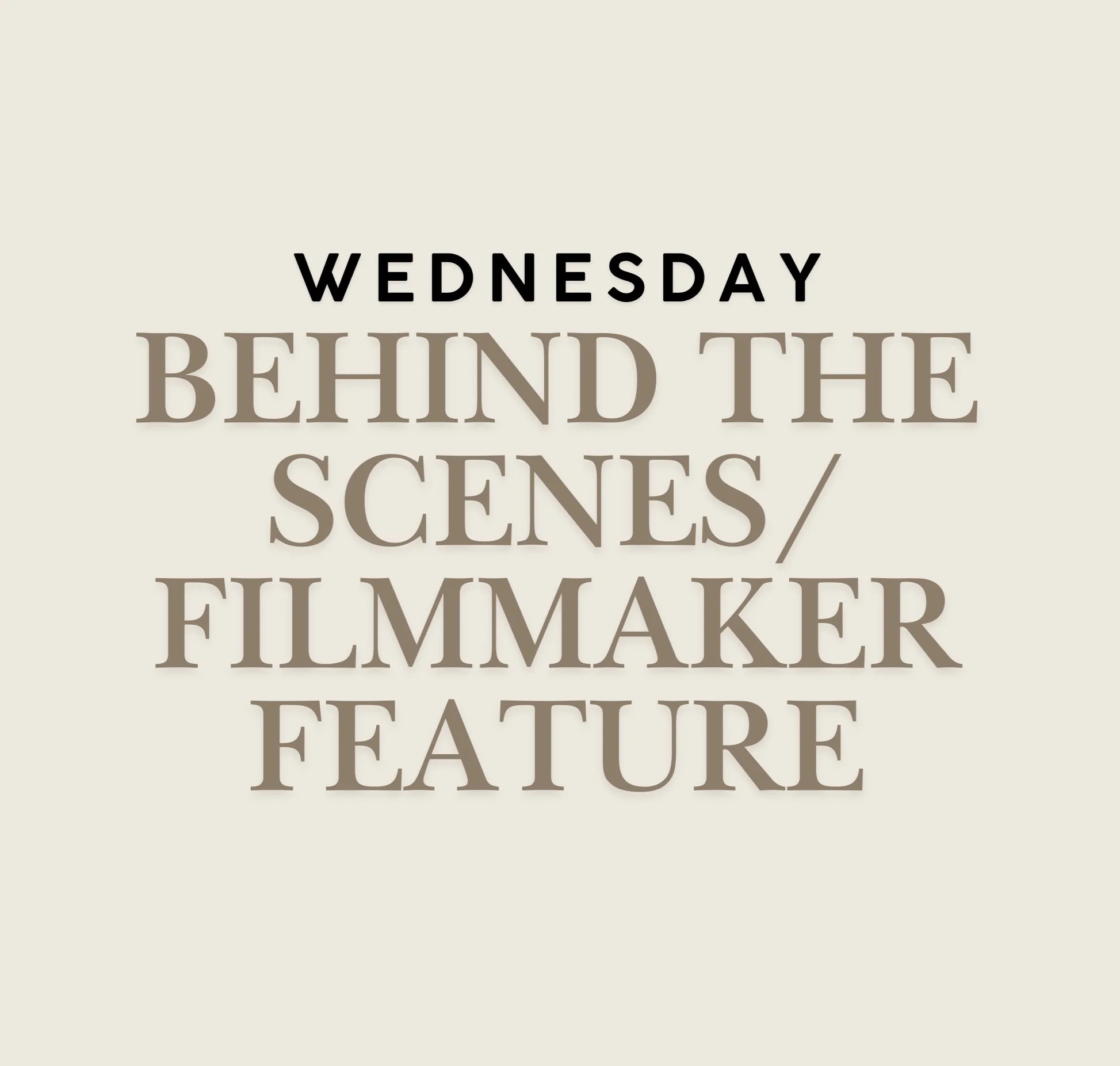
Our team was responsible for promoting featured films, discussing genres, and spotlighting individuals involved in the festival. To create a structured and manageable workflow, we implemented a themed posting schedule.
Each of the five members on the Instagram Stories team was assigned a specific day of the week to ensure consistency and prevent creative burnout. This system also allowed us to maintain a steady stream of high-quality content throughout the festival’s promotional period.
Improving Team Workflow & Collaboration
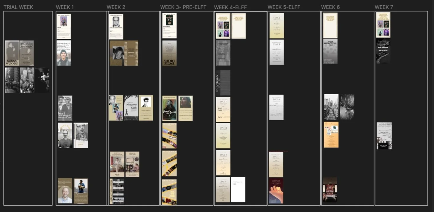
To enhance team organization, I developed a visual content calendar where members could drag and drop their designs into designated slots. This eliminated the need to sift through disorganized files in Google Drive and gave us a real-time overview of upcoming content. Additionally, since many of my teammates had limited experience with graphic design tools, I provided guidance on layout, composition, and branding best practices to ensure our posts remained fresh yet cohesive.
Impact: Increased Engagement and Brand Recognition
By maintaining a consistent posting schedule and reinforcing the festival’s brand identity through color, typography, and content themes, we successfully increased both viewership and engagement on Instagram. The festival’s online presence felt more polished and professional, attracting greater attention from potential attendees. Our strategic approach not only elevated the festival’s image but also streamlined the creative process, making content production more efficient and impactful.
This project reinforced my ability to lead a team, establish a strong brand presence, and optimize creative workflows—valuable skills I continue to apply in my UX and brand design work today.
