Redesigning the Henry Ford Museum Website: Reflecting Community, Innovation, and Accessibility
Situated in Dearborn, Michigan, The Henry Ford Museum is surrounded by a diverse community, including a large Arab American population. Given this local context, we wanted to explore how the museum’s digital presence could better reflect this surrounding community and improve the experience for all visitors.
The museum’s website had many valuable resources, but we quickly identified a few key areas for improvement: the site’s navigation system was overwhelming and repetitive, making it difficult for users to find what they were looking for. Additionally, the museum’s content didn’t fully represent the diversity of the communities it served. We also knew that school tours were a major part of the museum’s offerings, so we wanted to understand how K-12 educators felt about using the website to plan events and visits.
Our design process focused on simplifying the navigation and introducing features that would make the museum’s website more inclusive, educational, and accessible.
Understanding Key Communities and Their Needs
-
With Dearborn being home to one of the largest Arab American populations in the U.S., we wanted to understand how the museum's website could better reflect the contributions of this community to American innovation. Our goal was to explore how the museum could engage with its diverse surrounding population, especially through its digital presence.
-
School tours are an essential part of the museum's offerings, and we recognized that the website’s ability to support educators in planning these visits was crucial. We wanted to gather feedback on how easy it was for teachers to access important information, such as tour schedules, lesson plans, and activity resources.
-
We also focused on issues related to connectivity and accessibility. How easy was it for visitors to access the site for ticketing information or to navigate the content, particularly for those with accessibility needs? We wanted to ensure the site served a wide range of users, including those with disabilities.

Interviews as a Window Into the Museum’s Public Perception
We were particularly interested in understanding how the museum "came off" to people—both in terms of its digital presence and its broader community involvement.
Was the website reflecting the diverse history and contributions of all Americans, or did it feel more tailored to a specific group? Was it accessible and inclusive in a way that invited visitors from all walks of life to connect with the content?
Validating our Focus Area
Lack of Representation
Our secondary research confirmed that Dearborn's large Arab American population was underrepresented in the museum’s digital content. While the museum had made strides in celebrating diverse aspects of American history, its online presence failed to reflect the contributions of the local community. This insight aligned with our goal to foster more inclusive representation on the website.
Navigation Difficulties
We also examined how other museums engaged with educators and local communities online. Research revealed that many K-12 educators struggled to find educational resources and planning materials on museum websites. This further validated our intention to create a more user-friendly, accessible section for teachers and school tours, a critical step in enhancing the museum's digital experience.
Accessible Design Errors
Finally, our exploration of accessibility standards led us to utilize WCAG 2.0 tools and guidelines, as well as color blindness checker tools, to assess how well the site met the needs of visitors with impairments. These tools revealed areas where the site’s design could be improved to ensure greater accessibility, particularly for users with visual impairments or cognitive disabilities. We were committed to making the site more navigable for all users, regardless of ability, and ensuring that vital information like ticketing and educational resources were easily accessible.
Drawing Solutions From our Conversations
-

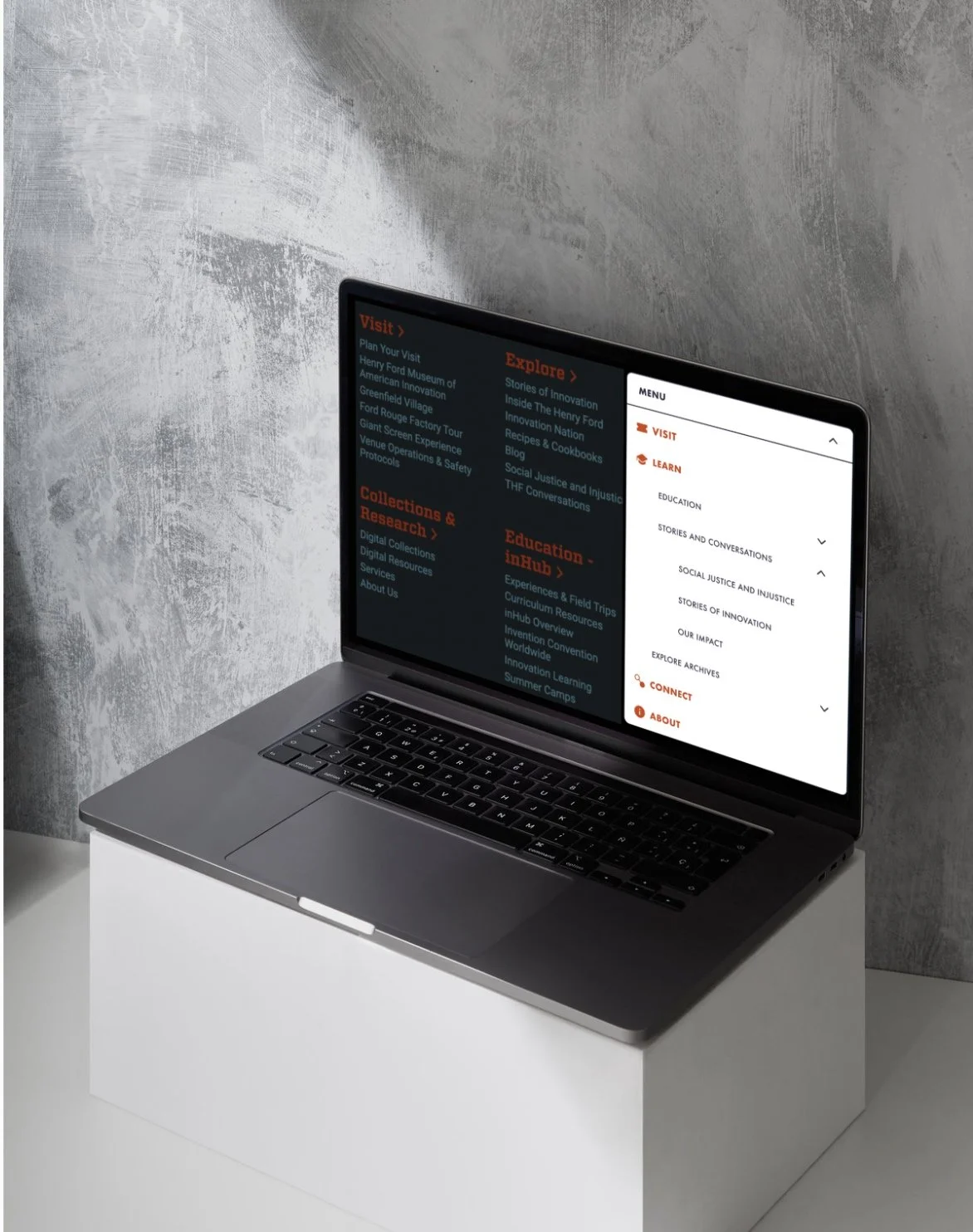
New Navigation System (Right)
The original site’s navigation (left) was cluttered, with redundant links and confusing categories. To improve this, we reorganized the structure, creating a cleaner, more logical flow that helped users find key information quickly. We prioritized accessibility by choosing ADA-compliant fonts and color schemes that ensure readability for all users. Additionally, we scaled the navigation menu for better clarity and ease of use, making important sections—such as ticketing, school tours, and accessibility features—easily accessible.
-

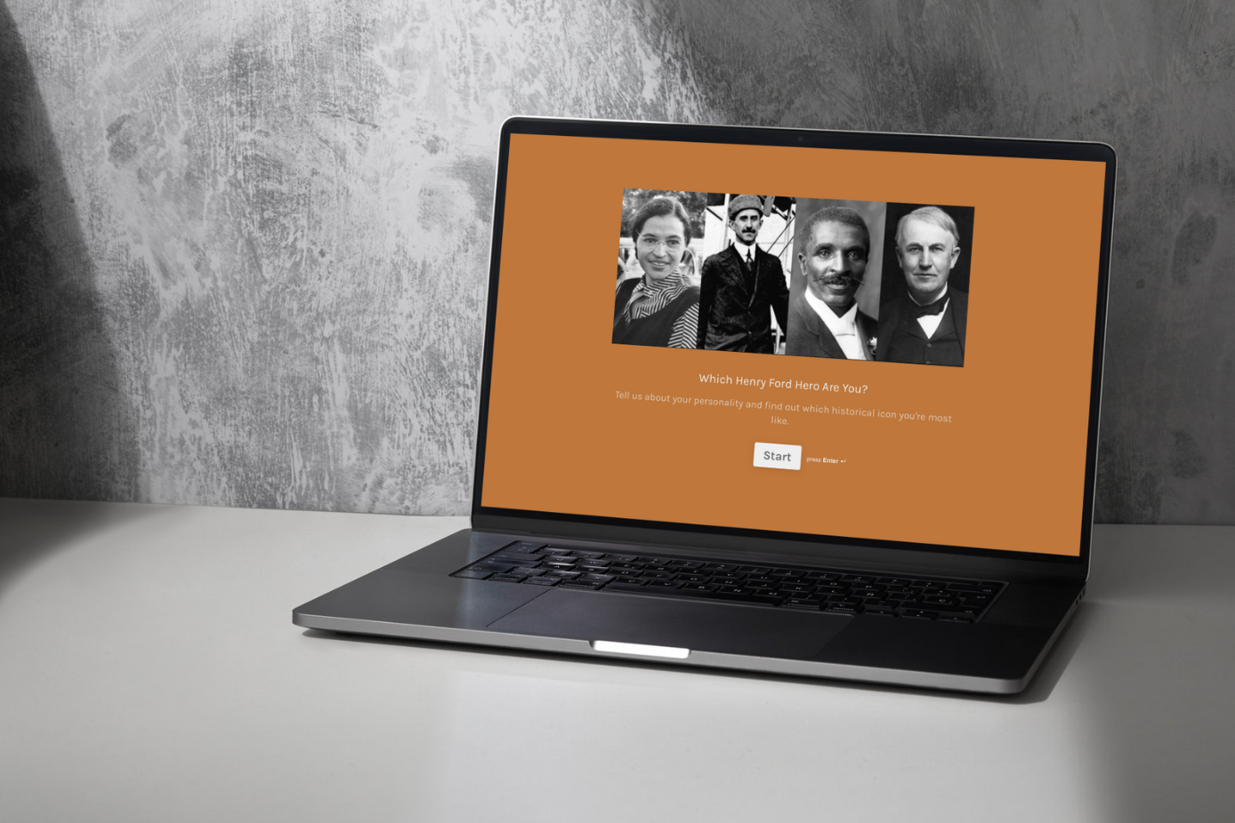
DEI-Driven Quiz
To engage users and introduce them to the museum’s focus on diverse contributions to American innovation, we created an interactive quiz. This DEI-friendly quiz matched visitors' responses to the personality traits of historical innovators, helping them discover which figure they were most like based on qualities like creativity and resilience. It was designed to immediately connect users to the museum’s values of inclusivity and representation, providing an engaging, educational experience right from the start.
Impact Through Design, On Community
One of the most rewarding aspects of this project was creating a solution that not only improved usability but also reinforced the museum’s mission to celebrate innovation in all its forms. The feedback we received validated our approach, showing that even small changes in navigation and content representation can have a big impact on how users connect with the museum. This project highlighted the power of thoughtful UX design to connect users to the mission and values of an institution, and it reinforced the idea that design can be both functional and impactful when it centers on the needs of the community.
This project was completed as part of the MI 841 Advanced Methods of Understanding Users Master’s course at Michigan State University.
